Sooooo, over the past few weeks I’ve been continuing down the alternative processes path.
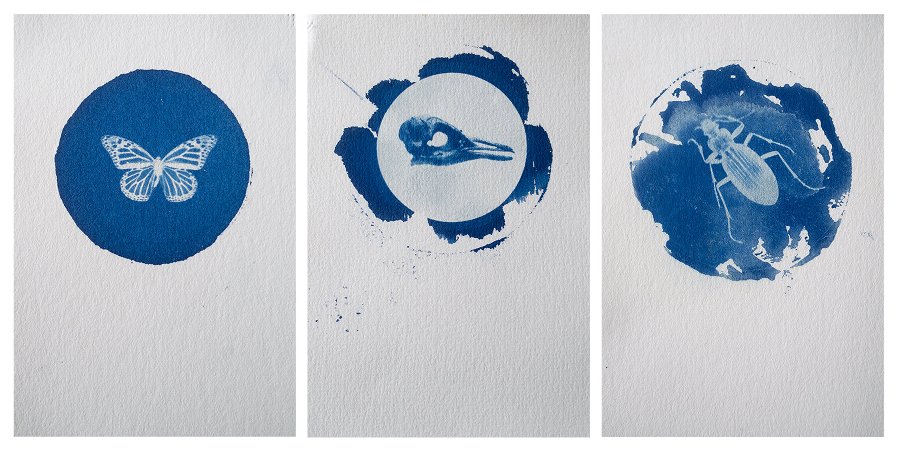
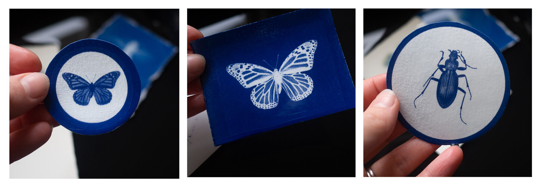
I’ve finally had some very rich blue cyanotype prints. I’ve tried a few different papers, the cheapest seems to be working out the best (yay!)
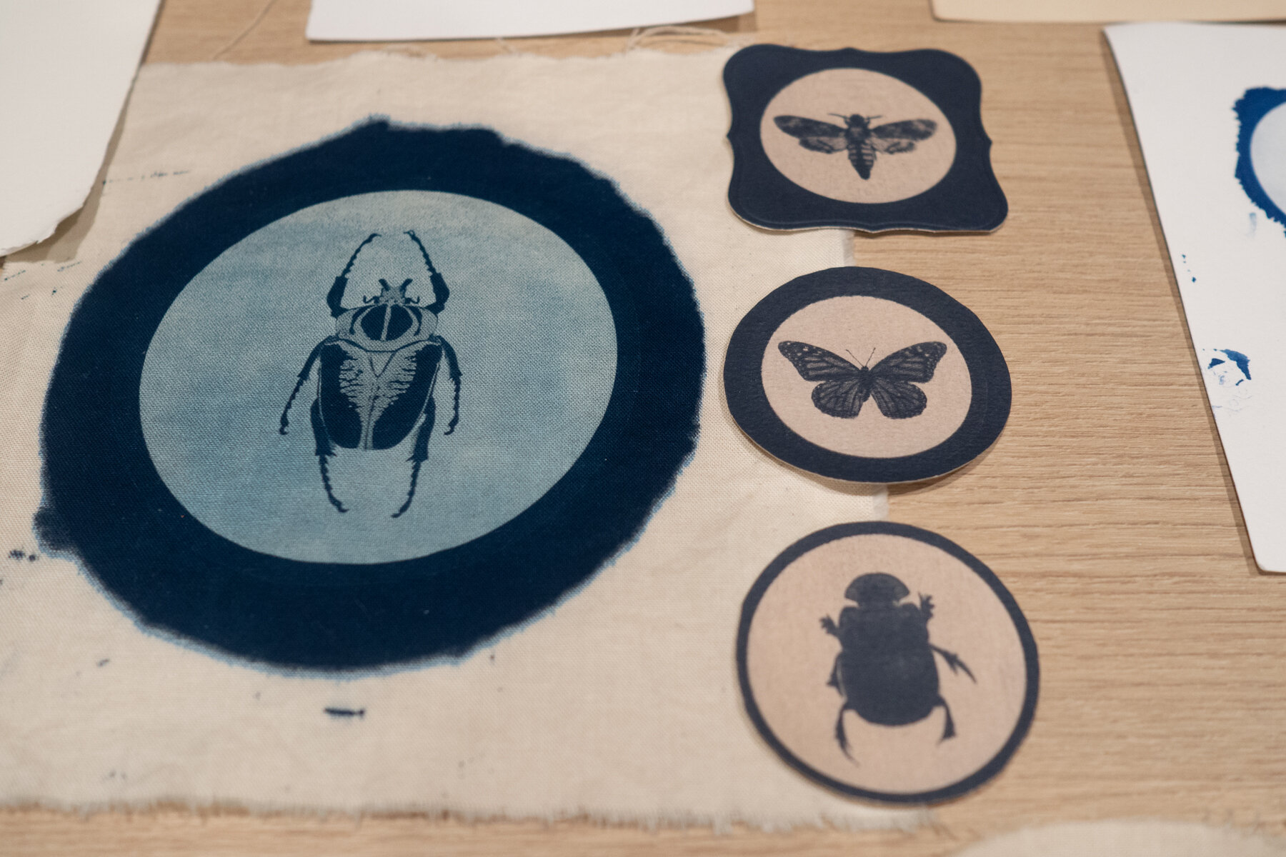
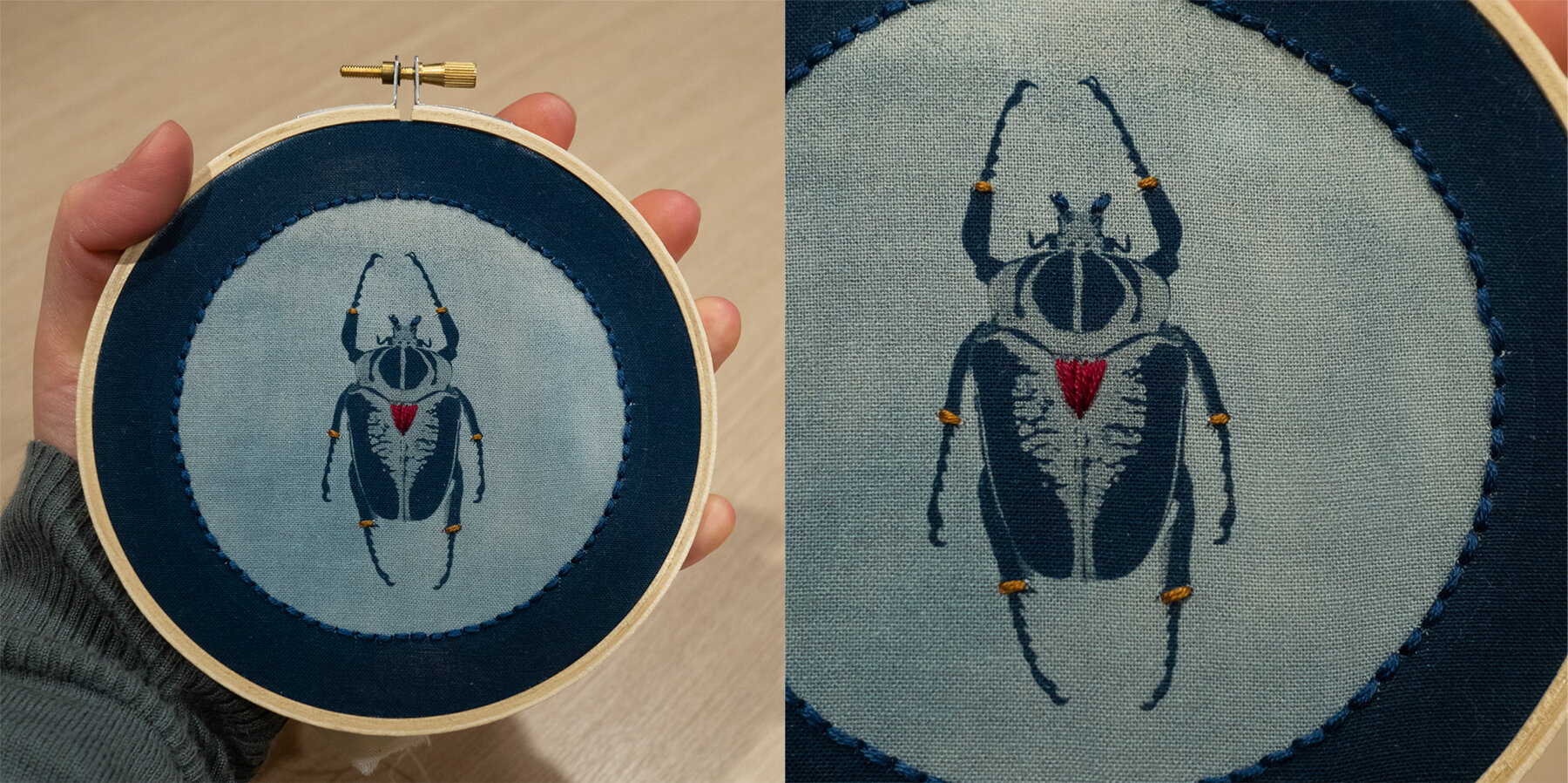
I went to the Otago Museum and photographed the bugs up in the animal attic. I chose to photograph bugs because I needed to see how much detail I can get with my digital negatives and how much would transfer onto paper and fabric.
We have an old inkjet printer at work that we no longer use so I dug it out and printed onto some transparency’s (not the expensive photography branded ones, just the cheap $1 per sheet office type ones).
After playing around with a few printer settings I started to get some really nice strong negatives.
The files have to be quite high contrast to get nice results.
So we have these:
But now I have a little dilemma …….
Negative or positive image?

Clean or dirty?

Bleached?
Toned?
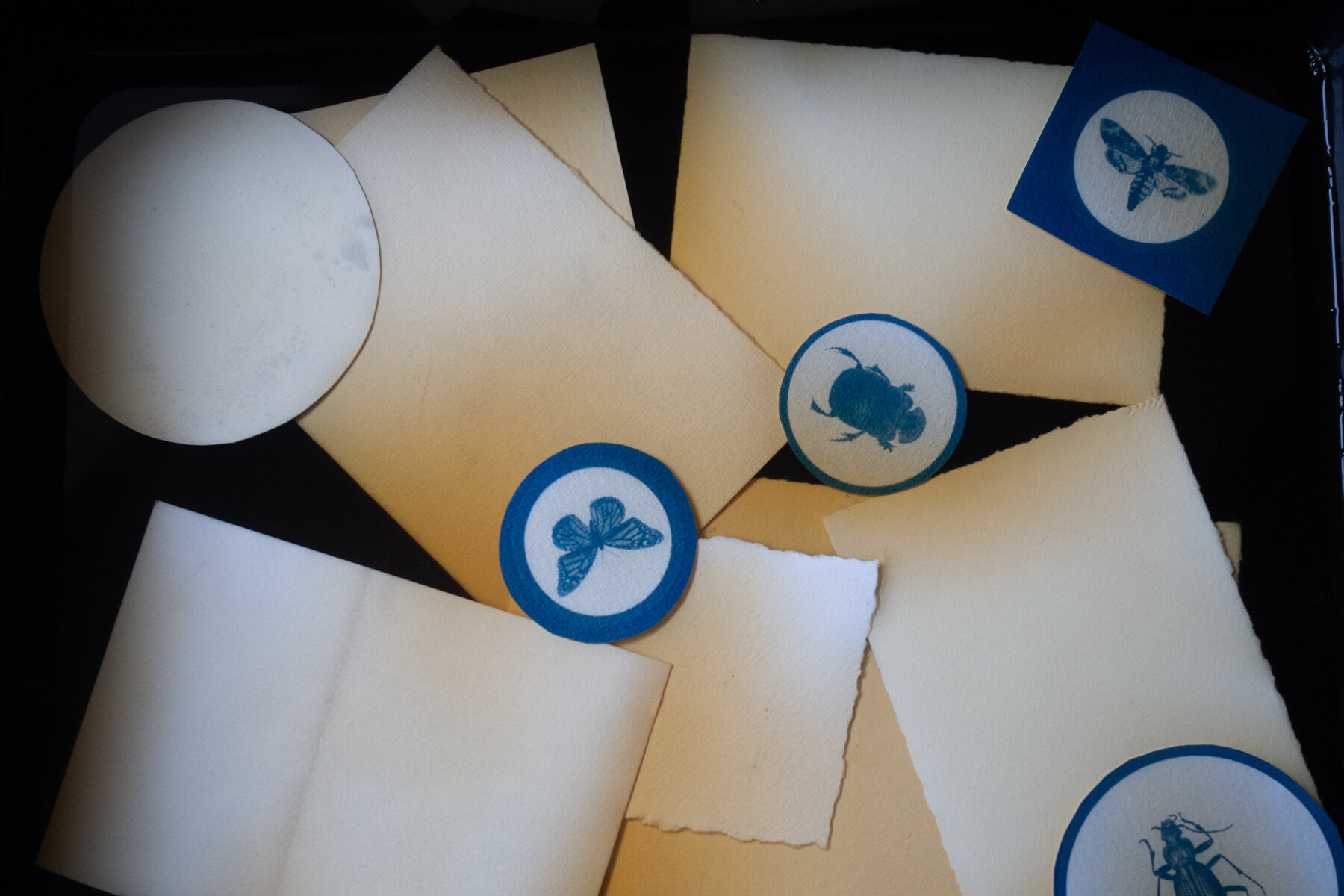
Bleached and toned? square? round? rough edge or smooth? So many choices!
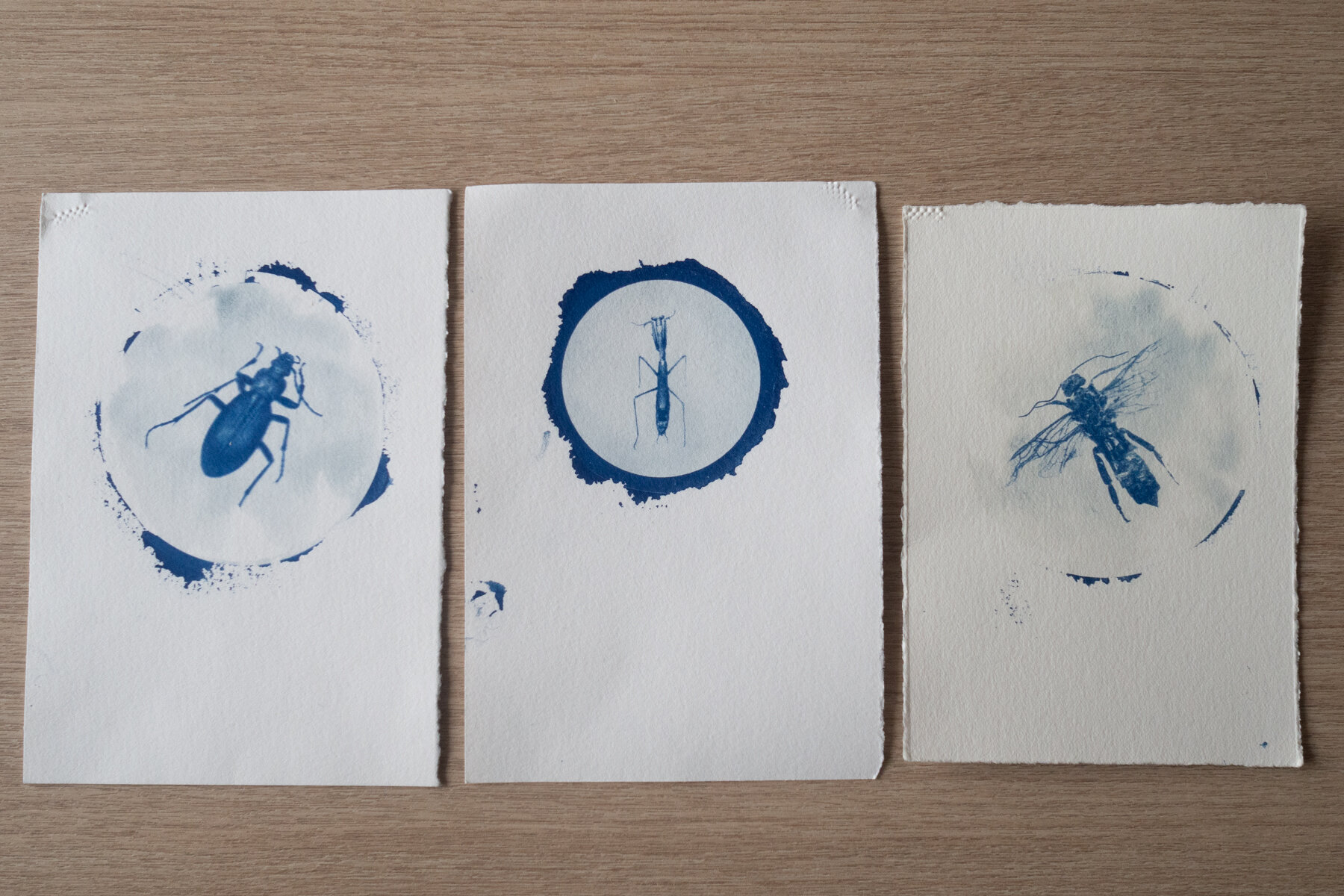
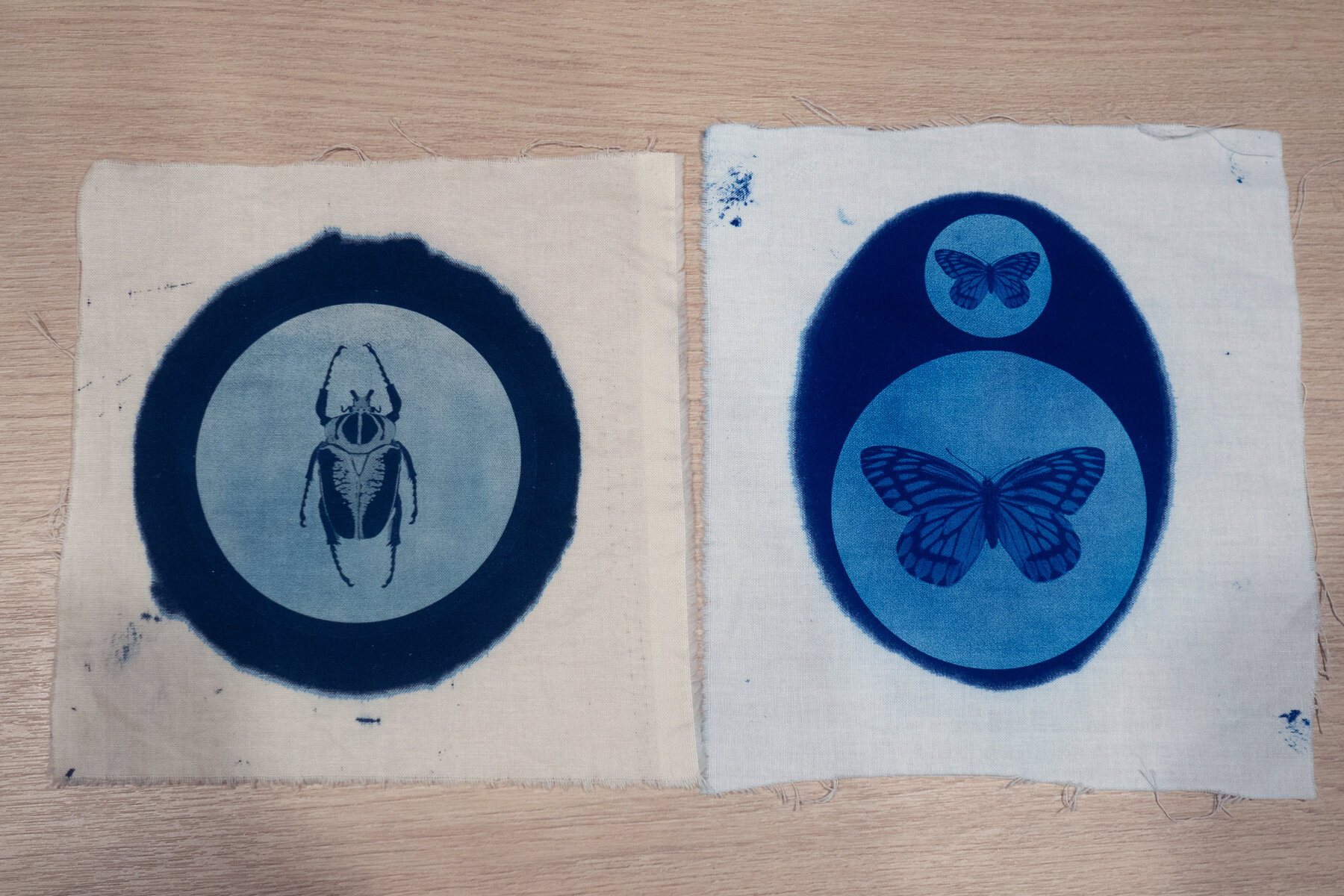
How about fabric?

Yes I should have ironed them before photographing them! But you get the idea.
My first attempt on fabric was a major fail so I wasn’t expecting much second time around, boy was I surprised. They were detailed, sharp and BLUE!
I was blown away just how much detail was there to be honest and they are SO sharp!
I found printing on multiple bits of paper at one time you have to make sure there is even pressure over all of them or they don’t get good contact with the transparencies. They can end up quite blurry.
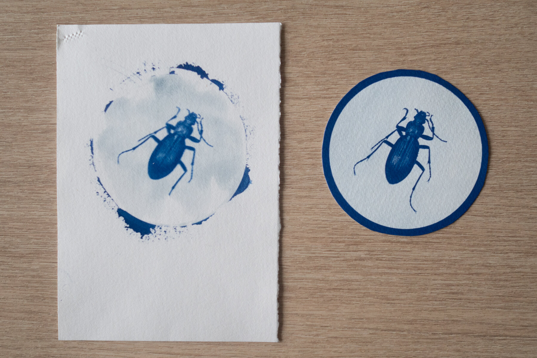
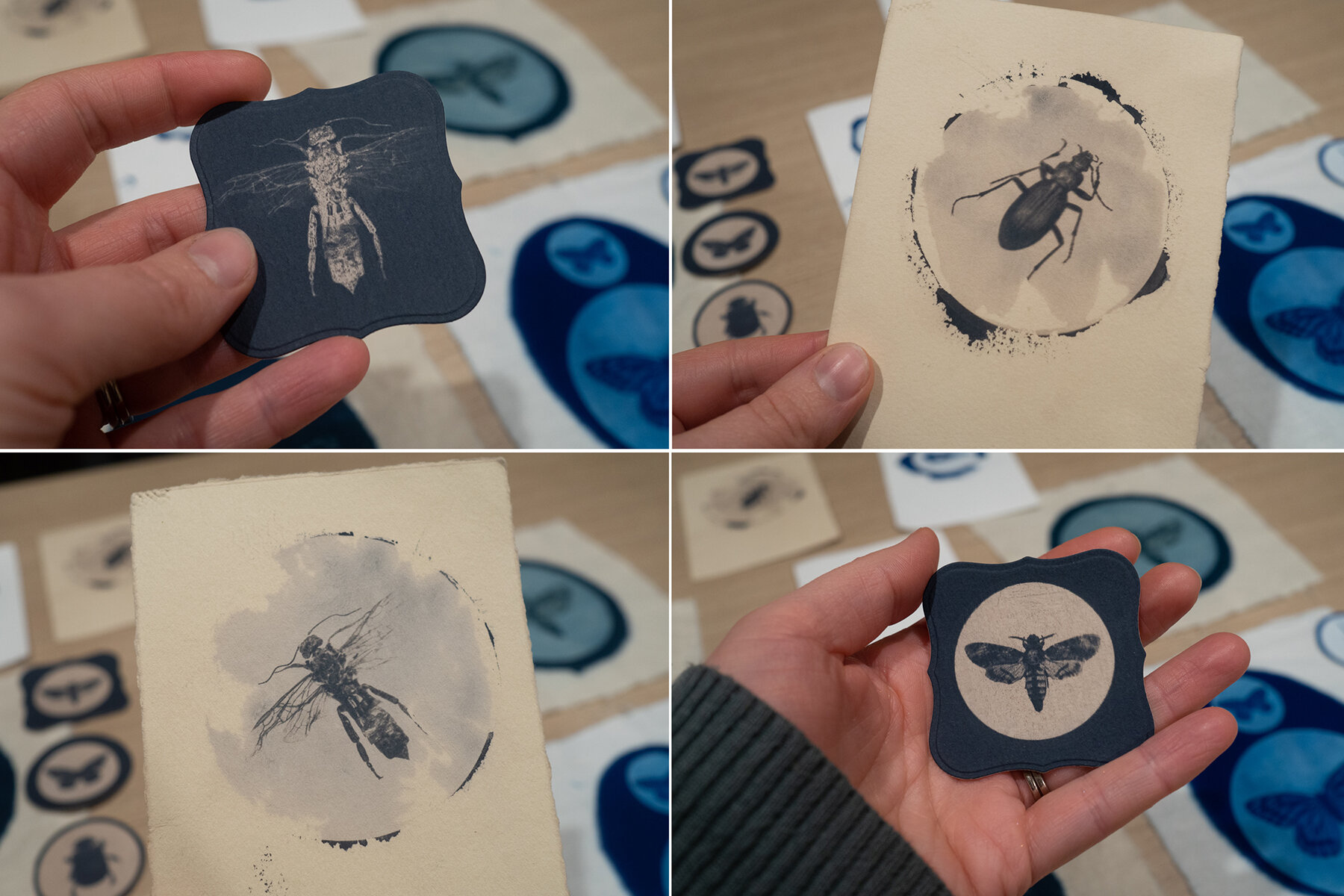
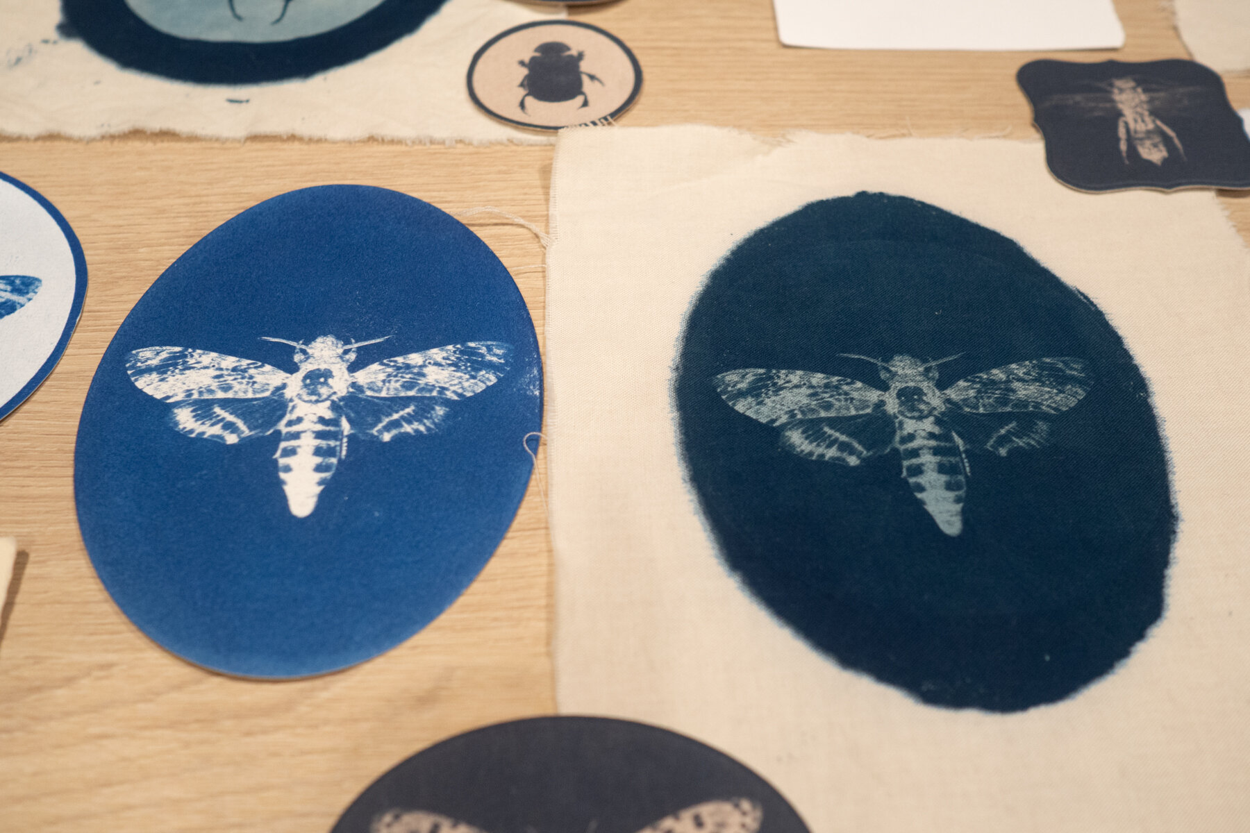
I decided to bleach three out of the four pieces of fabric to get some good comparisons.

The bleaching process cleans up the highlights and intensifies the deep blue. I used Sodium Bicarbonate as the bleaching agent (washing soda). It only takes seconds to bleach it too far so you have to be careful or you loose too much density.
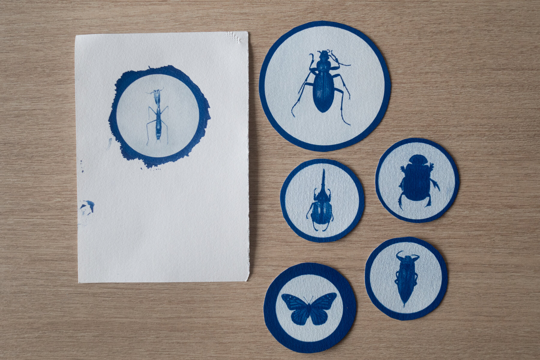
I toned the bleached the fabrics in coffee (this time I used rebrewed coffee grounds). It worked but its much more subtle than the paper versions. You can see the colour difference above between the original on the right and the toned image on the left.
I’m not sure why but when ever I tone something I instantly regret it and hate it. Its not until I go back and look at it after its dry that I actually like it.
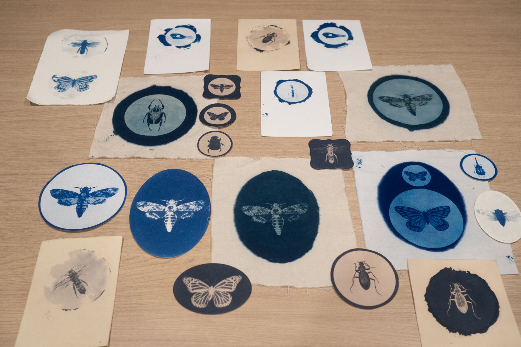
I’m really stuck on which colours to go with, I know the muted tones are more ‘me’ but then I’m kind of thinking what’s the point in doing cyanotypes if your not going to keep them their traditional Prussian blue?
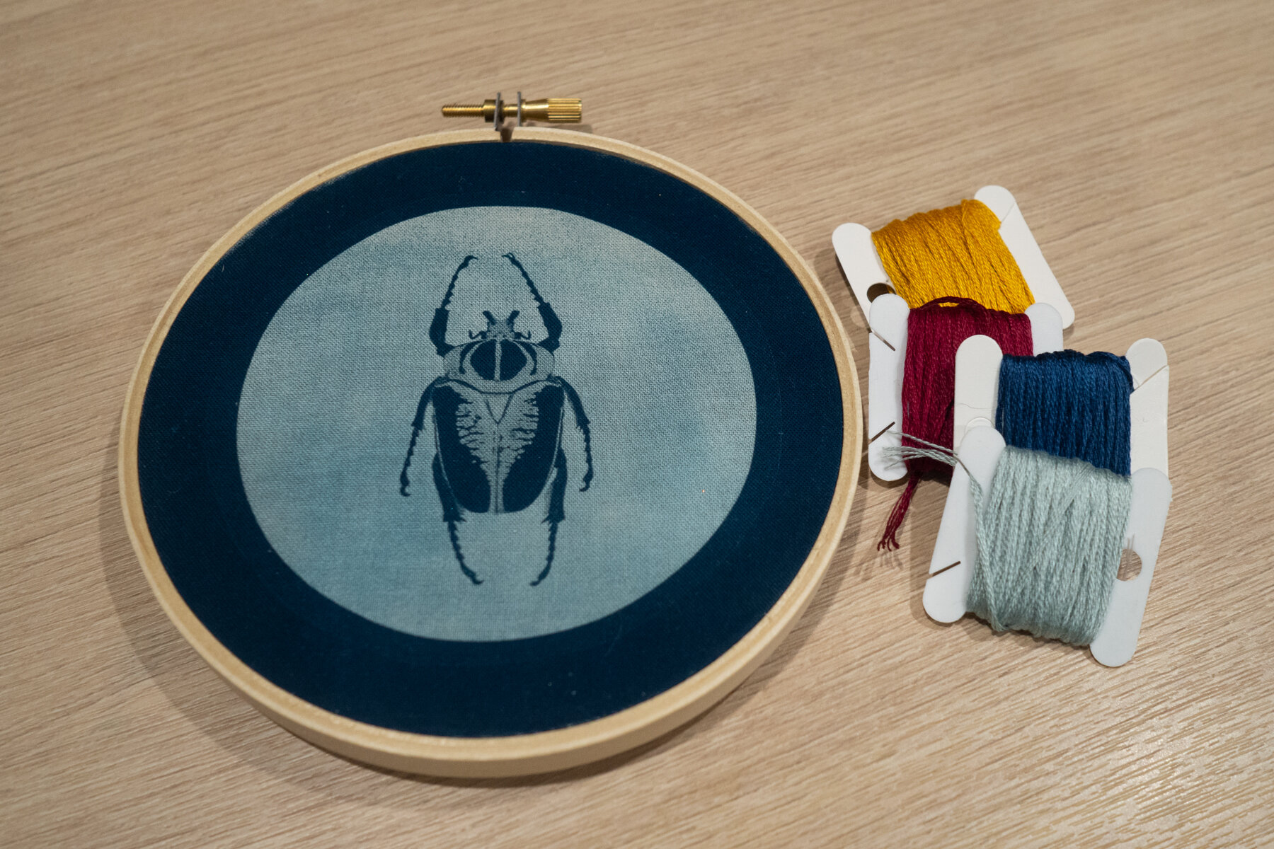
And why not throw in some embroidery while I’m at it? After all that was kind of the point in trying the fabric option.
I have no idea where I’m going with all of this, just trying to enjoy the process without having an already thought out end result.
I normally rush to get that result too, I do it with photo shoots all the time, hopefully this will help me slow down a bit.
I’ll keep playing I think……